
WhiskyBack BLACK concept rendering
Intermittently serving design work to the beer industry. Below are samples of works I have contributed to the entire lineup for both Ramsay’s Dram WhiskyBack™, Portland, Oregon and GoodLife Brewing Company in Bend, Oregon. Both companies utilize Laramie Studio’s full service of capabilities, well, sans medical illustration. From branding to 3D modeling and rendering, these beer portfolios give all stakeholders an accurate look at the product which lends to better decision making in the design and a helpful tool if seeking to align with investors or communicating complexities with print shops.
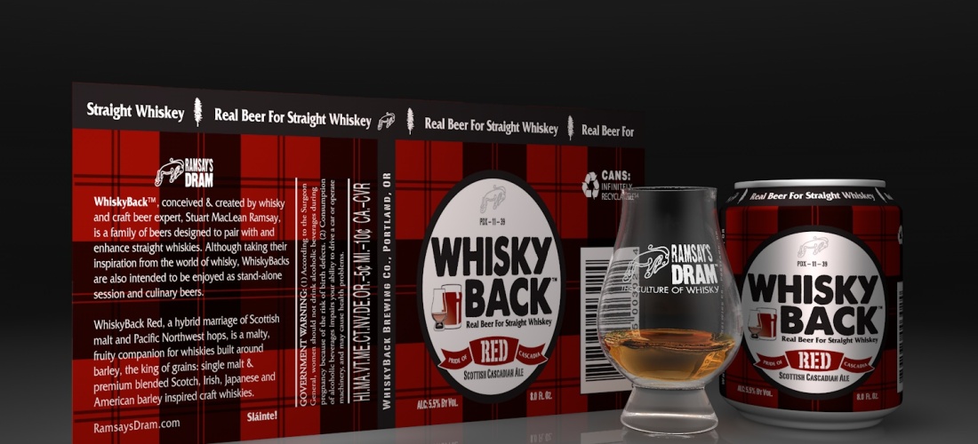
WhiskyBack™, conceived & created by whisky and craft beer expert, Stuart MacLean Ramsay, is a family of beers designed to pair with and enhance straight whiskies. Although taking their inspiration from the world of whisky, WhiskyBacks are also intended to be enjoyed as stand-alone session and culinary beers.

Stuart- MacLean Ramsay Photo by: Brew Republic

WhiskyBack RED emblem

WhiskyBack RED concept rendering
WhiskyBack Red, a hybrid marriage of Scottish malt and Pacific Northwest hops, is a malty, fruity companion for whiskies built around barley, the king of grains: single malt & premium blended Scotch, Irish, Japanese and American barley inspired craft whiskies.
WhiskyBack Red’s target pairing is Scotch so we went with a classic tartan design. The can’s will come in the little 8 oz size.

WhiskyBack GOLD emblem
Fresh, crisp and clean, WhiskyBack Gold is a German & American-inspired Pilsner imbued with Pilsner barley, rye malt and maize, with a noble hop character intended to balance the vanilla caramel sweetness of classic Bourbon and Rye whiskey.

WhiskyBack GOLD concept rendering
For the can design we landed on a background texture of Oak grain and some accents of stars to best match the culture of American whiskeys.

WhiskeyBack BLACK emblem
Bittersweet, creamy and briny, WhiskyBack Black is an Irish-inspired cream porter created as a feisty, mildly smoky companion for heavily peated single malt Scotch, pure pot still Irish, Scottish coastal and Campbeltown drams.

WhiskyBack BLACK concept rendering
Best paired with Irish and Scottish drams, the can design work pulled from Celtic pictish symbolism.
GoodLife Brewing Company

Company logo

Descender I.P.A. can art layout and design

Descender IPA design applied to can 3D render mockup
Up, down, up, down. That’s life here in Bend, Oregon. Up one mountain, or stream, or trail, or rock wall, and down another. Makes ya parched! So, we’re always up for a cool, fresh brew when we get down. Like this one. Descender is dedicated to our hometown of Bend – an adventurer’s paradise where people are up to all kinds of outdoor fun and have a thirst for the GoodLife.
Descender IPA is a blend of a big, true NW IPA mixed with some West Coast style. We balance the bitterness with the aromatics of the hops to make this a downright enjoyable IPA. Bottoms up!

Fresh palette of cans for Descender and Sweet As!

Mountain Rescue Northwest Session Ale can art layout and design

Mountain Rescue Northwest Session Ale design applied to can mockup.
Sometimes, pursuing the GoodLife here in Bend, Oregon takes you to the edge. And over it. Our Mountain Rescue Session Ale is named for those gutsy men and women who put their own good lives on the line to save ours. Who rescue us when bad things happen and we go over the edge. We toast them and say, “Here’s to a long, happy, GoodLife – for all of us!”
This life-enhancing brew is a balance of NW hops and light alcohol. Clean and crisp with hints of citrus and pine. It’s a savior to savor anytime. Enjoy the GoodLife and be safe out there!

Beautiful Nursing pin from the 50’s
The Mountain Rescue Northwest Session Ale art was inspired by my dear old mom’s Nursing pin.

Sweet As! Pacific Ale can art layout and design

Sweet As! Pacific Ale design applied to can 3D render mockup
You may wonder, why the heck did we name it “Sweet As!”? Good question! “Sweet As” is a slang expression (mostly if you’re an Aussie or Kiwi!) that means awesome, bodacious, cool, radical… as in, “How were the waves today, Kev?” “Oh man, sweet as, bro!” Sweet As is what this beer is. A chill concoction brewed exclusively with hops from New Zealand and Australia. More Pacific and tropical in their flavor and aroma – just right for a light beer.
We wanted a craft beer for our blistering hot summer days here in our hometown of Bend. So we made one. And now everyone gets to enjoy the refreshing goodness of Sweet As year round!

Sweet Ass? No, Sweet As!
When Sweet As! was first concepted, the imaging invited some gray area as to the pronunciation. In the beginning of naming the beer, some people mispronunced it and said “Sweet Ass!” so the first design concept played to that with subliminal intentions. See it? The whole Sweet As wordmark was designed to contour to a woman’s derriere. The beer was originally brewed with hops from New Zealand hence the Maori-like tattoo designs. So now the graphic identity is the same tattoo look but on a hop cone instead, keeping it safe and P.C. Do you find the ass art offensive? Feel free to post a comment.

Image of Maori tattoo by Otautahi Tattoo in Auckland, NZ
All beer style stories for each beer were written by Tom Vandel of Les Overhead. I’m glad Tom is a part of the team. His word craft is very illustrative. Les Overhead and Laramie Studio are located in the same building #208 on SW 2nd Ave and SW Stark St in Portland and he’s a great Happy Hour mate!


 Using images to tell the story, I’m going to share how I made a V-Loc pattern brush with Adobe Illustrator and Photoshop.


